By giving your roll a unique theme, you can take your project from blah to bam! You might be saying to yourself “a theme? Like the way you customize websites?” That’s right! A theme is the quickest way to make a major impact on how your roll looks.
How And Why To Pick A Theme:
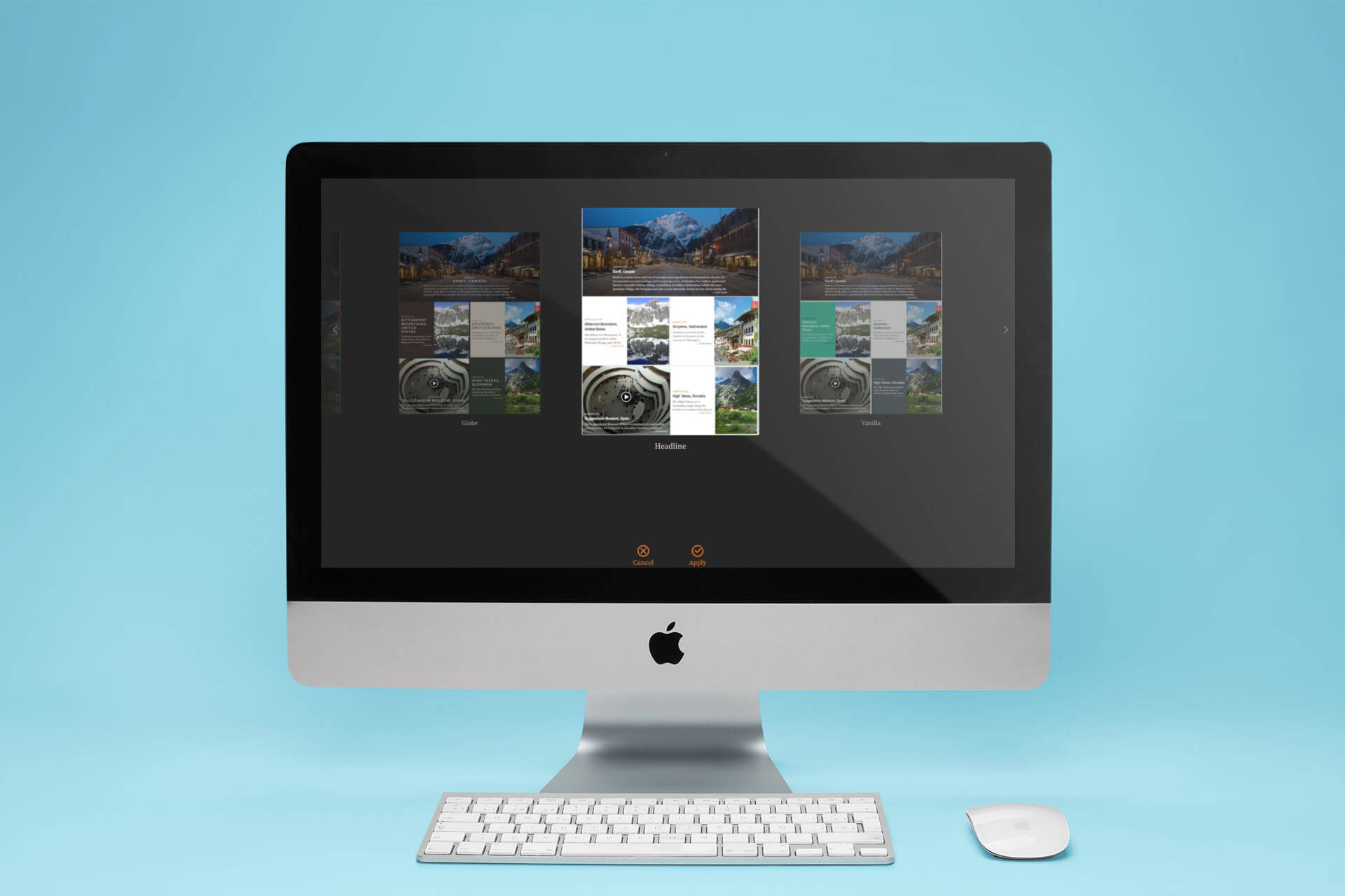
When you generate a roll for the first time, Bublup defaults to the “Headline” theme for you automatically, but you can easily pick a different one. When you first make your roll, you can click on the “theme” tab to choose from one of six options. You can also apply a new theme later. Just enter edit mode inside your roll then choose “change theme” from the main menu. It’s easy to carousel through the options and see how your roll will look with each theme, so go ahead and test them all.
What Does Each Theme Look Like?
HEADLINE – The Minimalist One
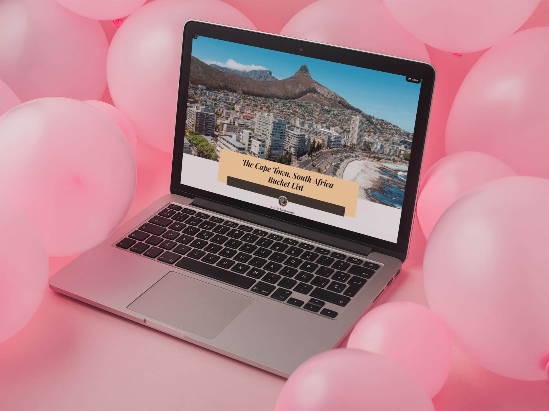
Headline is Bublup’s default theme because it is easily the most popular of the six options. Due to the neutral color scheme and crisp white text boxes, it works for just about every story or collection. Since all the visual emphasis is put on your words and images, it’s the cleanest slate you can work from.
GLOBE – The Earthy One
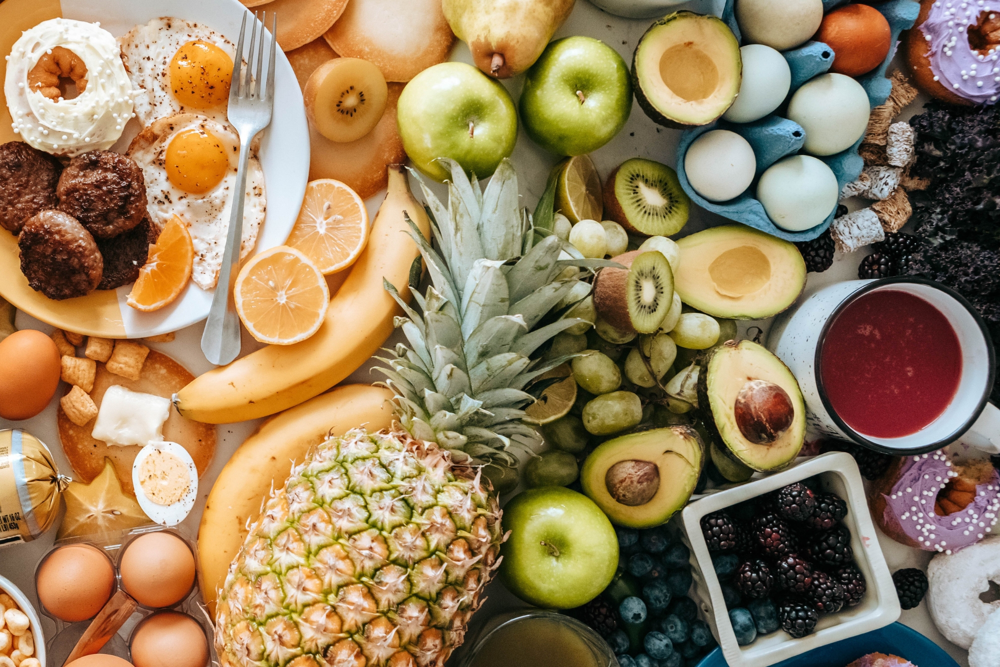
Globe’s theme is full of earthy browns and greens, making it the perfect fit for collections or stories on food, health, nature, photography, and travel. With its capitalized and clean fonts and overall darker look than other themes, it also lends itself to more serious subjects.
EXPRESS – The Subtle One
Express has just enough color to give your stories an extra pop of personality but keeps it classy with its primarily pale blue, gray, and white color scheme. This theme is great for just about any topic as well but gives you an opportunity to add a little color to your roll.
COSMO – The Fun One
Cosmo is the most stylized of all the themes, with its multicolored bright and pastel text boxes and decorative fonts. It’s useful when you want to give your rolls a youthful or positive vibe, and looks great with all kinds of lifestyle stories.
BLADE – The Edgy One
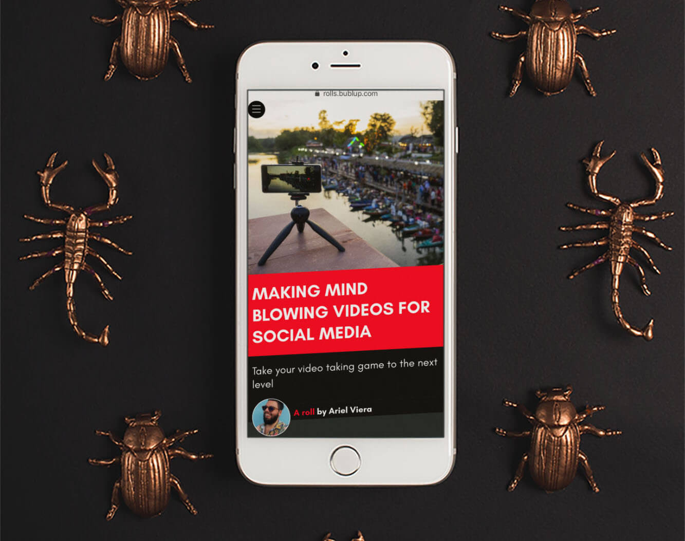
Blade has a red, black, and white color scheme with slanted text which gives an edgy feeling to your roll. Blade works great for stories about sports, entertainment, tech, art – or any time you want to make a statement with big impact.
VANILLA – The One That Pops
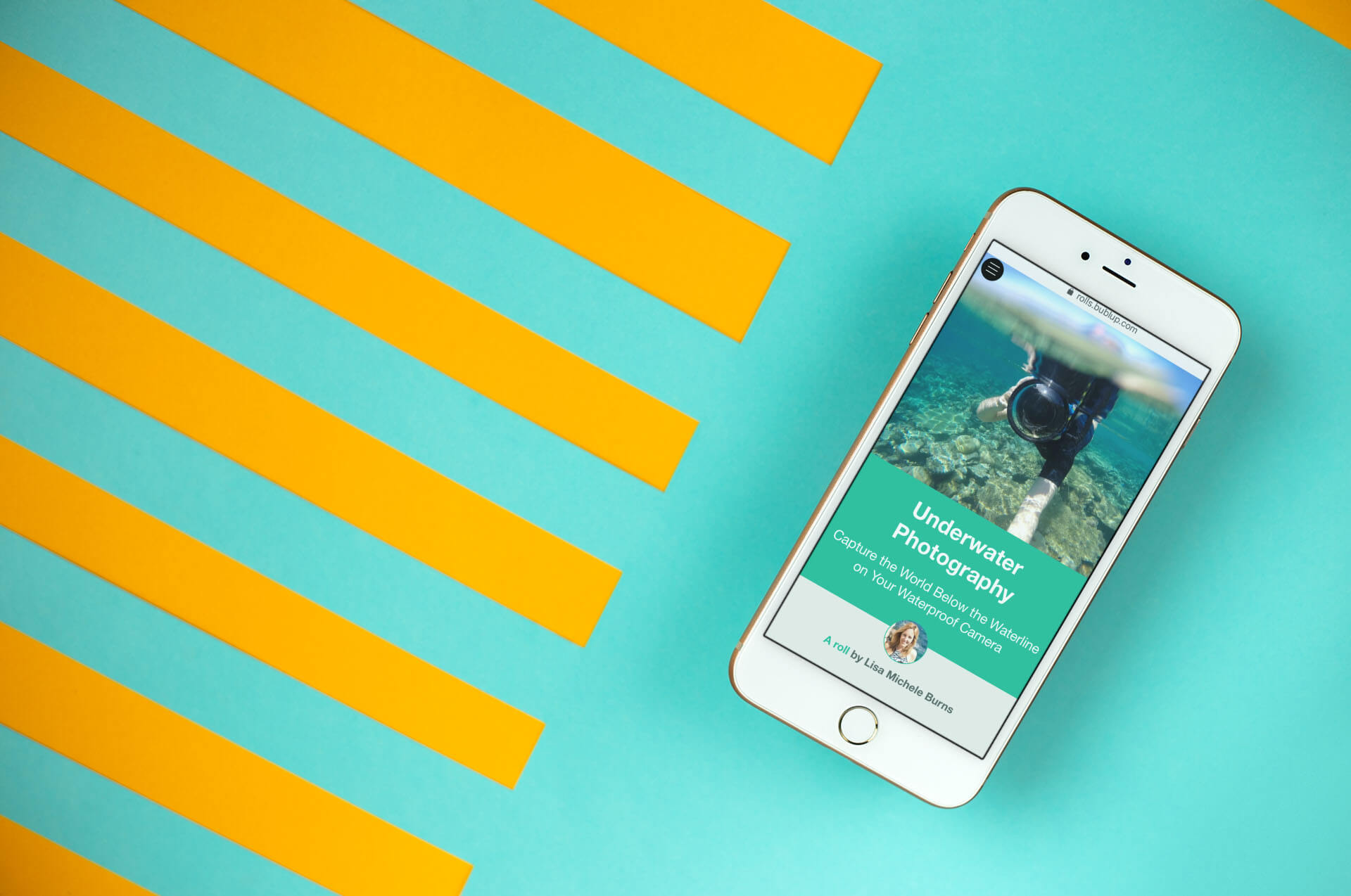
Vanilla is a high contrast theme. The black, bright teal, and pale grays are appealing, yet punchy and that’s the kind of content Vanilla is perfect for. Vanilla can help make your collections or stories even more compelling, so try it out when you’ve got a big idea to share, a great story to tell, a concept to explain, or a cause to promote!
Final Words:
Remember: Changing the theme is a great way to give your roll a visual boost, but there’s so much more you can do to really turn it into a killer collection or story. Check out this roll for tips on how to make yours both design and SEO friendly.
More To Come!
Bublup is still in beta, so we’re all ears when it comes to feedback! Write to us and send us your thoughts whenever you like.
