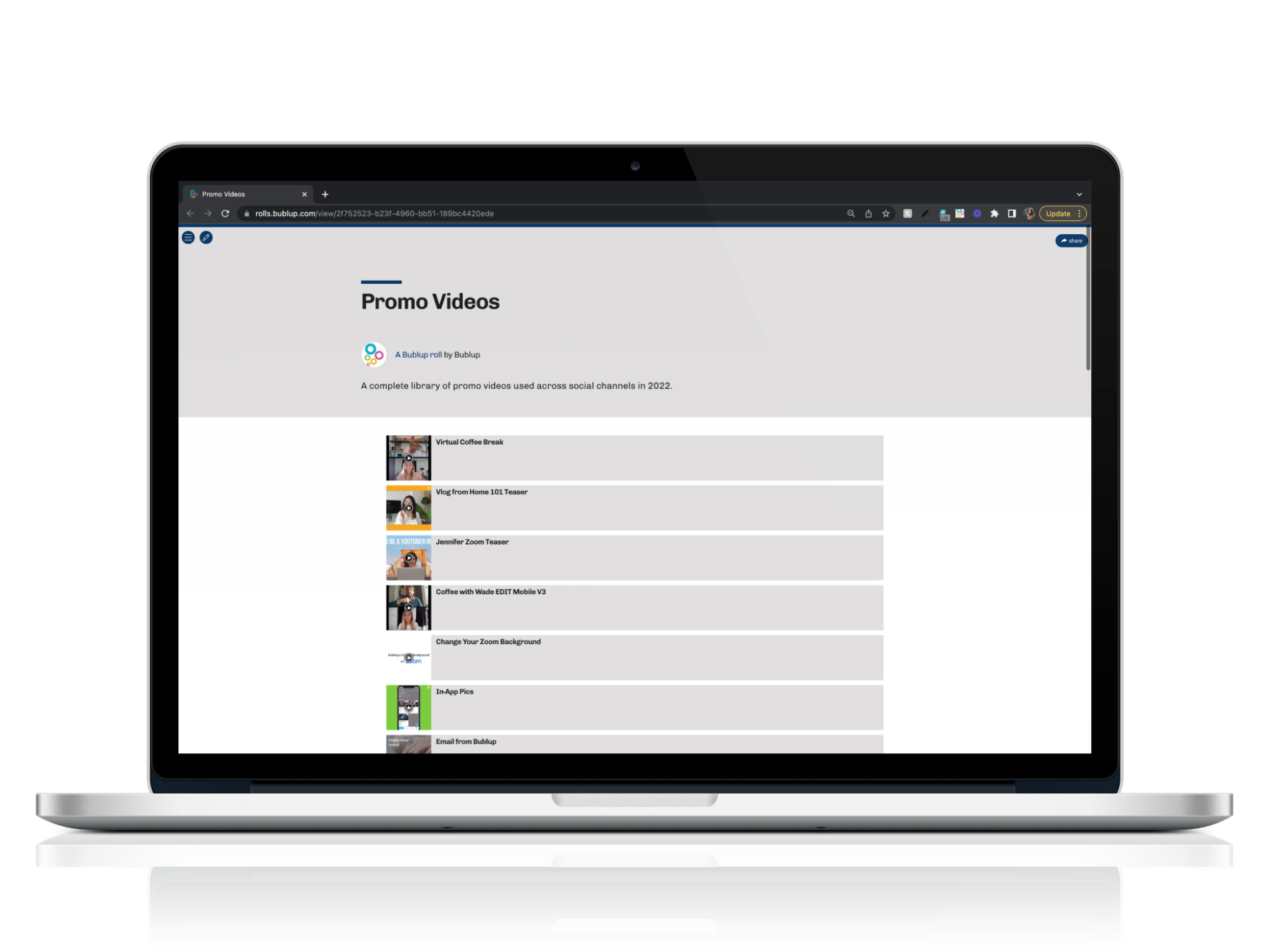
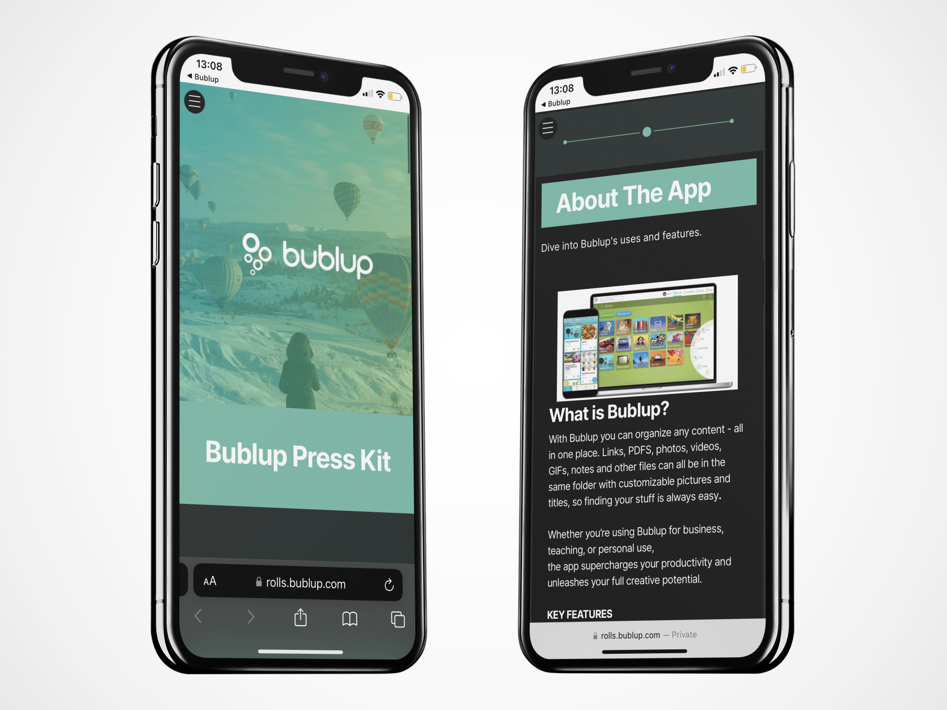
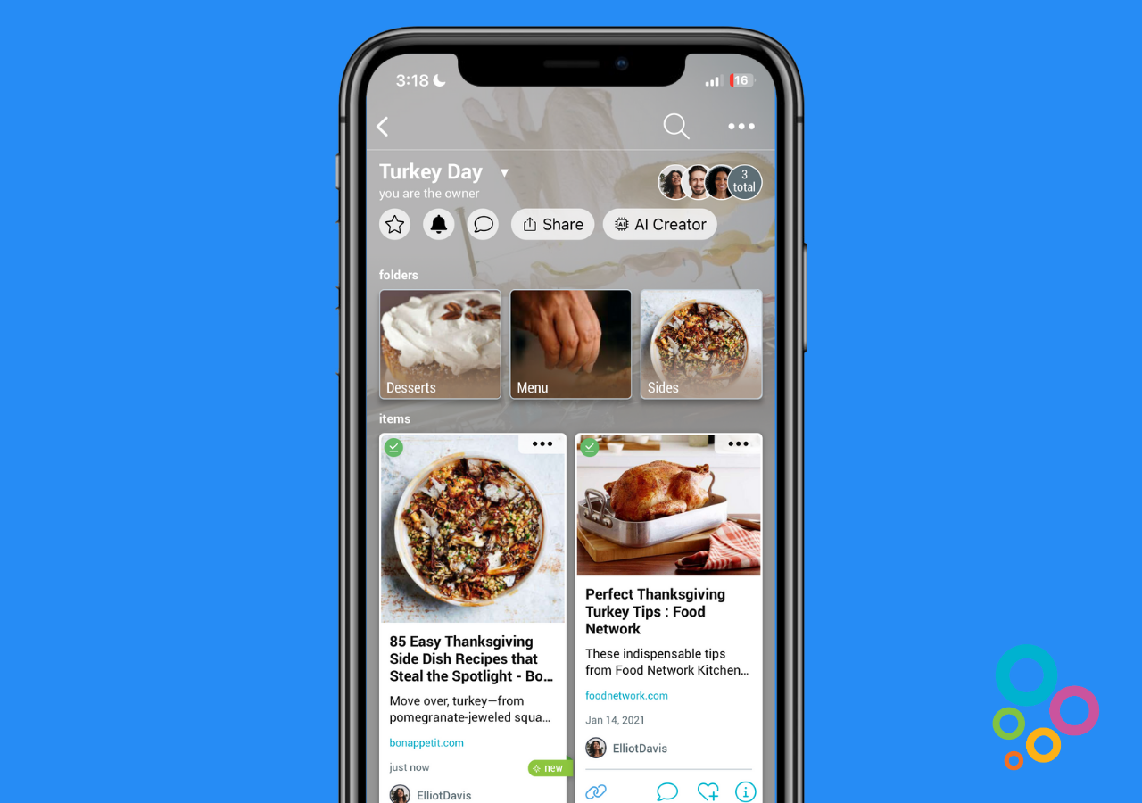
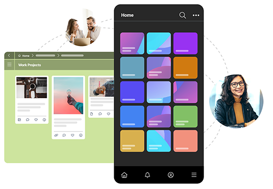
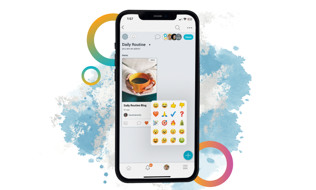
Business professionals love using Bublup to manage many aspects of their work life. Collaborating with colleagues, saving important information, and transferring big files are just a few of them! If you’re new here, Bublup is a mobile and desktop app that allows you to save photos, videos, files, links, and notes together in visual, customizable folders. The content you add to your folders can be easily shared as an instant web page called a Roll. Bublup Rolls are a great way to share information, pitch projects, and even give a presentation. There are 17 Roll themes with fully customizable color palettes to choose from, but some may be better suited for the workplace than others. If the style you’re going for is polished and professional, these are the five themes that will impress colleagues and clients.
1. Express
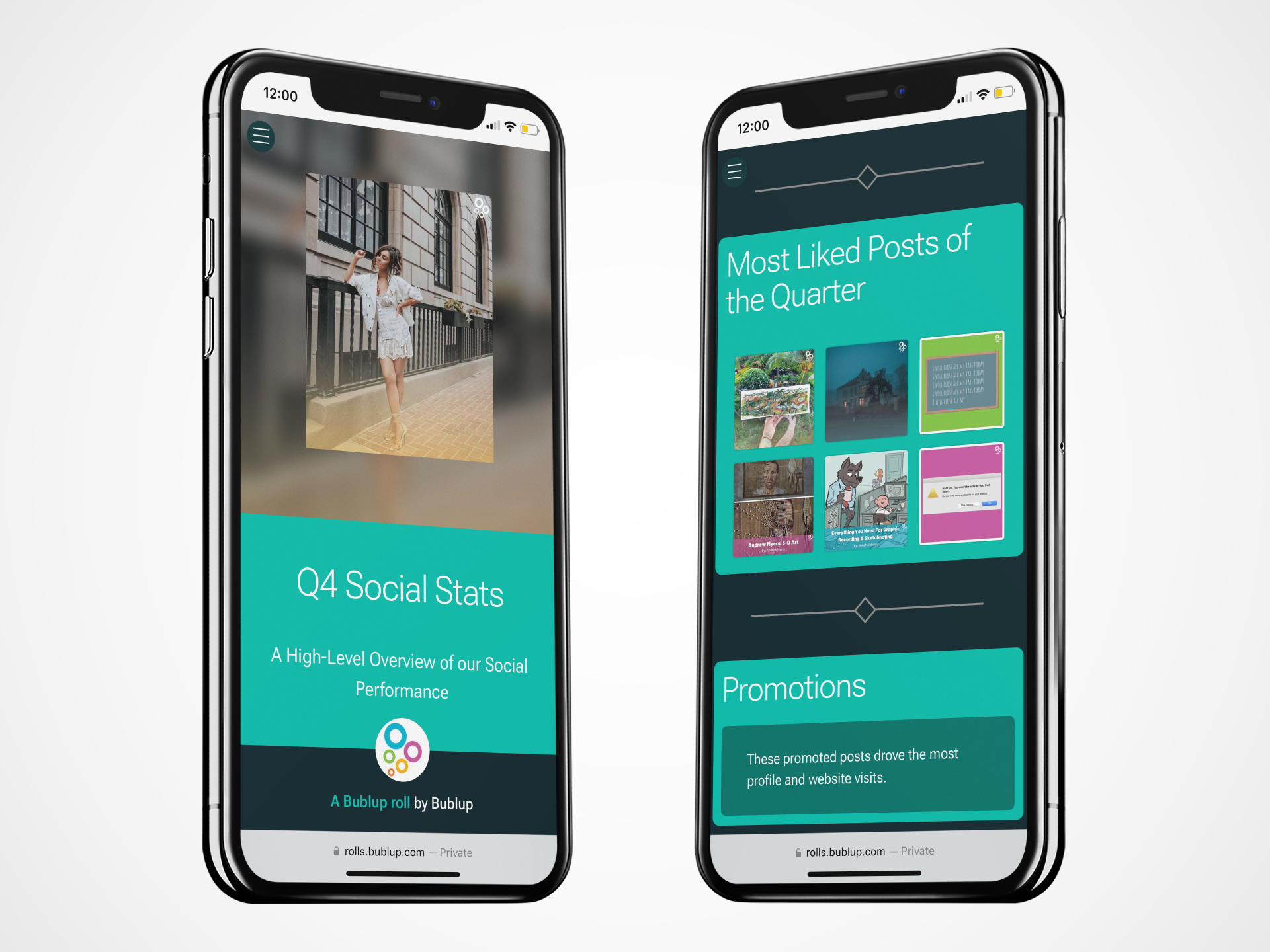
Express is a classic-looking theme, and gives you a simple framework that can be customized to create an on-brand Roll that catches the recipient’s attention. It’s a real crowd-pleaser, if you will. It works especially well with longer titles and offers five color palettes with a heavy focus on blue tones. Not feeling the existing palettes? You can customize the Roll with your own brand colors and font preferences, down to the amount of space between the letters! (*Note: some customization options are Premium features.)
Express also features an aesthetic line with diamond-shaped detail that divides your sections and gives the Roll a subtle bit of flair. Keep in mind that you can experiment with different layouts for your content (for example, “gallery” to display a group of images!)
2. Globe
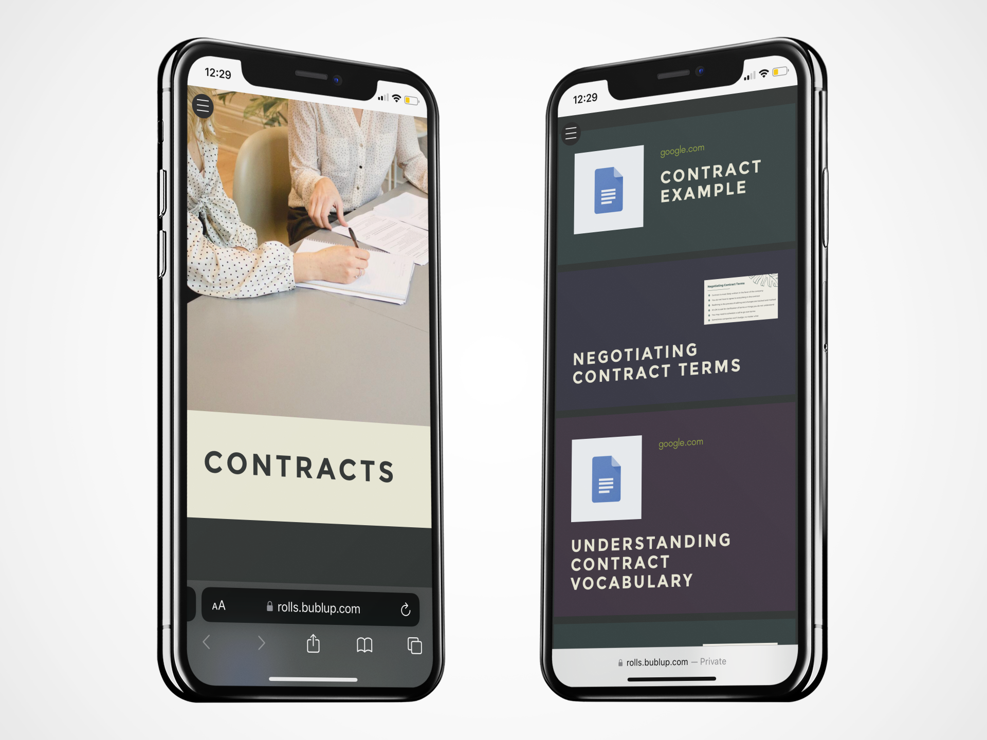
Globe is a theme that we like to describe as assertive. The title fonts are aligned left and are all in capital letters. We all know capital letters attract attention, but not in a screaming kind of way, we promise. Well-suited for short titles, Globe offers three color palettes that are subdued and a bit earthy. Again, if you love the theme but not the palette colors, feel free to customize them yourself. Your sections are separated by a thin line with circle-shaped details, and documents are presented particularly well in this theme using the layouts “Float left” and “Float right”.
3. Headline
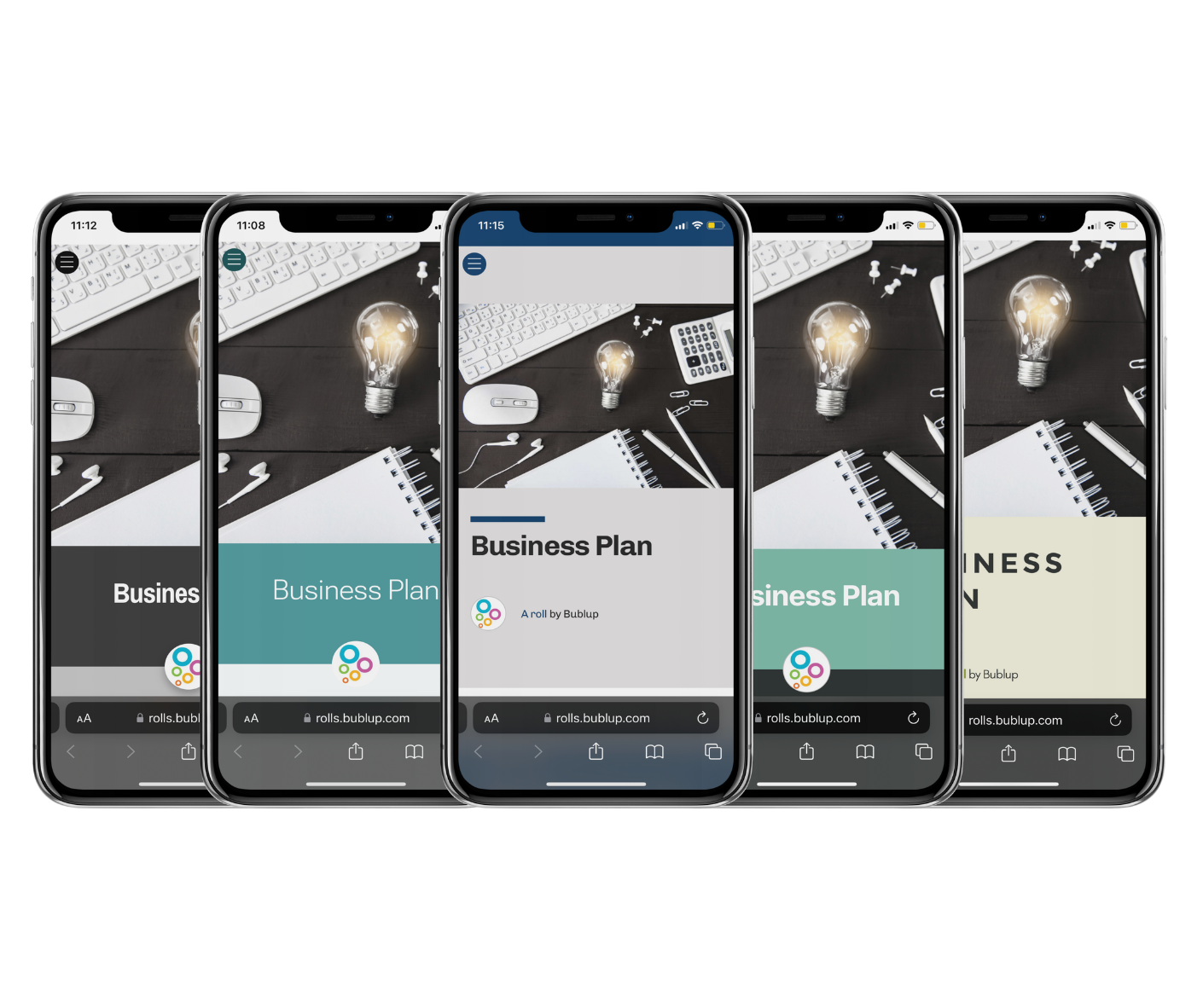
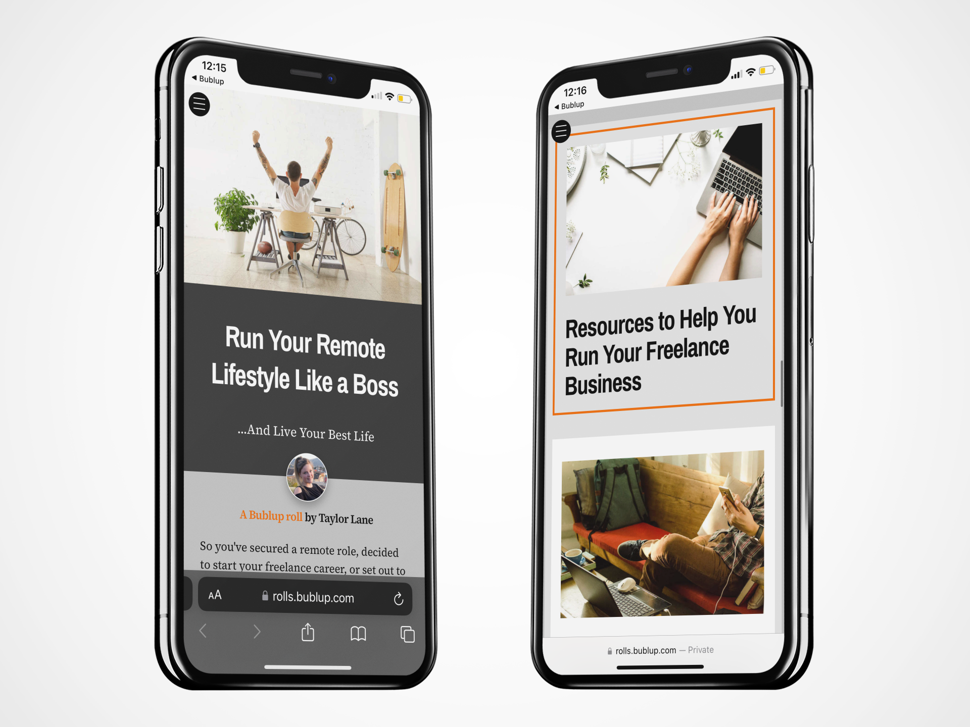
Headline is bright, straightforward, and works well with long titles. The theme offers four bold palettes that include crimson, indigo, olive, and a default palette that is dark with orange accents. You’ll find that the color you choose applies hues of that color all over the entire Roll- a bold header, subtle background, and colored thin rectangular line around each section title. This theme is stylish with no frills and is suitable for any professional content you might share.
4. Showcase
Content shared in a professional capacity should be simple yet stylish, and Showcase is exactly that. It features bold, clear text that is suitable for any content. It works best for small and medium amounts of content, and offers six unique color palettes. Some of the colors really pop (Purple, Orange, Aqua, and Mint) while the other two are much more neutral. Section titles have a short, thick line above them, a design feature that complements content presented in list form. Showcase looks great while being very straight and to the point!
5. Vanilla
Vanilla is anything but vanilla. It is timeless and well-liked by many, but its three palettes are attention-grabbing and in some cases, a bit edgy! Licorice, for example, fills the entire Roll with darker hues, accented by a lovely shade of blue-green. Customizing just the accent color with this palette choice can make for a really beautiful Roll with a bit more personality than your other options. This theme is really great if your profession has some creative leeway to work with.
In Summary
Rolls are all about showcasing your content, but our impressive themes and curated color palettes make sure you start off on the right foot. If you need guidance on how to change your Roll theme or color palette, detailed instructions can be found here and here. If you are new to Rolls in general, anything and everything you need to know about creating them can be found on our support page here. If you’re more of a visual learner, these tutorial videos from our Rolls Master Class may be for you!
